I've posted about this before and made more progress, so this is an updated report about how my orthography has evolved since I made three posts about it at the end of '07, and things you might consider as you develop your own orthography.
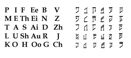
I just couldn't leave well enough alone. I had my orthography, it worked, but each time I looked at it, there was still something that bothered me - ome little nagging itch in the back of my brain somewhere. So one day as I was sitting in a meeting, I starting listening to my itch to see what where it lead. Now these are little things, but maybe something I learned will benefit you, too. So here is the alphabet I had settled on previously:
 This font, you might notice, is extremely light compared to the English letters. I realized quickly that I should make the letters thicker, but this change could wait. An item of interest: the Pitak characters have thicker horizontal strokes than vertical strokes. I thought it would be interesting to see how this looked, since our English alphabet characters are thicker on the vertical strokes (meaning, the sides of an O are thicker than the top and bottom, and the same goes for the other letters). It mostly just made the letters look like the Hebrew alphabet.
I wasn't entirely comfortable with was the letter order/arrangement. I designed the Pitak letters to manifest certain phonetic characteristics; for example, the voiced characters have middle strokes, or partial middle strokes if they are a combined sound (ch=t+sh, a combined sound). I had tried to arrange the letters so that the "related" letters flowed together, i.e. the unvoiced plosives were together, the voiced plosives were together, so that when you looked at the alphabet, you could see the relationships. The above letter order wasn't very conducive to that. I made a letter order I felt better about, and re-made the font, with vertical strokes now being thicker than the horizontal strokes, and I liked the way it looked much better: So now, the plosives are all on the left, or on the right, unvoiced or voiced, along with the unvoiced and voiced consonant combinations of ch and j, nestled in between the consonants that make up their sound. Then the second and fourth columns are fricatives, unvoiced and voiced. In the middle, nasals, a liquid, and h, because I wanted it to have a special heritage, if you will, of being a half letter, and that it is used in words for childhood, shortness, and etherealness. Also, semi-vowels are between the consonants and the vowels, showing their mixed heritage, and their letters are combinations of consonant and vowel shapes. Well the W and R are... the Y symbol is a bit of a stretch, to my mind. The ng sound is where it is because... well I was just experimenting, and thought I didn't want a voiced th sound, so substituted the ng sound in, so its close to the n sound, to which it is related.
This letter arrangement I liked much better, and I reworked a few characters to better reflect their new placement and their phonetic qualities. H is now a very minimal letter; only two strokes; this is to reflect the attributes I mentioned above, as well as a minimal effort being required to make this sound. Ch and J characters are better combinations of the letters for t+sh and d+zh.
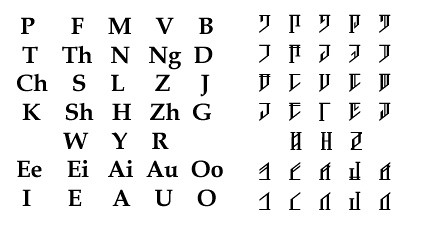
Now originally, I had 30 characters in the alphabet, which, on a keyboard, still allowed me some keys to make up punctuation. With the new alphabet, now I had 33 characters and I'm getting short on keyboard space. I wanted to have one character for each sound (meaning no sounds that require two letters, such as th, sh, ch), but I don't want to have too many characters either. I started wondering if I should shorten my phonology. I also wanted to improve my font; in comparison with the English characters, my letters look so little - I wanted to beef them up more. So I decided to cut out the ch and j letters, and the ng. I moved the l into the place of the ng, because this column is all voiced consonants, and h isn't voiced (h was the only other consonant I was considering moving). I also moved the postion of w, y, and r to where they match up more closely with the vowels they are close to.
 In this third iteration, that the characters are bigger, "beefier," and don't seem as small when compared to the English letters, and I think they could be even thicker and look better. When I prepared the earlier alphabet graphics, I actually had to use a bigger font size each time. This time, I didn't. As you create your own font, you'll probably go through similar trial and error, until you know exactly how thick, how tall, and how wide you need to make your letters. Again, I used High-Logic's FontCreator 5.6 to create this font.
So, this year I decided that my font STILL was not fit for public consumption and opened up FontCreator once again. But this time I was determined to create at least two good, solid fonts: an older, runic style and a newer, modern style. Here's the older, runic style. Tthe letters are a better match size-wise to the English font, and I think the simplification of the strokes makes it nice, simple, and it still has a bit of a serif on the diagonal strokes to give it a little style. Also, I had never been completely comfortable with the M and N characters above - so note the change to the upper and lower cross stroke on the new M and N characters.

Now here's the newer, modern style! I thought about what might make the above font look more modern or even a little futuristic, and the thing I kept coming back to was "fewer strokes" to make a character. So I got rid of the "neck" of the character shape, making it look like an alphabet of the number seven. Note also that I closed the open shape of the R character, making it into a Z.

I'm very satisfied with these! I still want to make a cursive, elegant font as well. Every time I've tried one, I've been very lukewarm with the results and never finished it. I may just have to find a friend with a Wacom tablet and borrow it just for this.
I just couldn't leave well enough alone. I had my orthography, it worked, but each time I looked at it, there was still something that bothered me - ome little nagging itch in the back of my brain somewhere. So one day as I was sitting in a meeting, I starting listening to my itch to see what where it lead. Now these are little things, but maybe something I learned will benefit you, too. So here is the alphabet I had settled on previously:
 This font, you might notice, is extremely light compared to the English letters. I realized quickly that I should make the letters thicker, but this change could wait. An item of interest: the Pitak characters have thicker horizontal strokes than vertical strokes. I thought it would be interesting to see how this looked, since our English alphabet characters are thicker on the vertical strokes (meaning, the sides of an O are thicker than the top and bottom, and the same goes for the other letters). It mostly just made the letters look like the Hebrew alphabet.
I wasn't entirely comfortable with was the letter order/arrangement. I designed the Pitak letters to manifest certain phonetic characteristics; for example, the voiced characters have middle strokes, or partial middle strokes if they are a combined sound (ch=t+sh, a combined sound). I had tried to arrange the letters so that the "related" letters flowed together, i.e. the unvoiced plosives were together, the voiced plosives were together, so that when you looked at the alphabet, you could see the relationships. The above letter order wasn't very conducive to that. I made a letter order I felt better about, and re-made the font, with vertical strokes now being thicker than the horizontal strokes, and I liked the way it looked much better:
 So now, the plosives are all on the left, or on the right, unvoiced or voiced, along with the unvoiced and voiced consonant combinations of ch and j, nestled in between the consonants that make up their sound. Then the second and fourth columns are fricatives, unvoiced and voiced. In the middle, nasals, a liquid, and h, because I wanted it to have a special heritage, if you will, of being a half letter, and that it is used in words for childhood, shortness, and etherealness. Also, semi-vowels are between the consonants and the vowels, showing their mixed heritage, and their letters are combinations of consonant and vowel shapes. Well the W and R are... the Y symbol is a bit of a stretch, to my mind. The ng sound is where it is because... well I was just experimenting, and thought I didn't want a voiced th sound, so substituted the ng sound in, so its close to the n sound, to which it is related.
This letter arrangement I liked much better, and I reworked a few characters to better reflect their new placement and their phonetic qualities. H is now a very minimal letter; only two strokes; this is to reflect the attributes I mentioned above, as well as a minimal effort being required to make this sound. Ch and J characters are better combinations of the letters for t+sh and d+zh.
Now originally, I had 30 characters in the alphabet, which, on a keyboard, still allowed me some keys to make up punctuation. With the new alphabet, now I had 33 characters and I'm getting short on keyboard space. I wanted to have one character for each sound (meaning no sounds that require two letters, such as th, sh, ch), but I don't want to have too many characters either. I started wondering if I should shorten my phonology. I also wanted to improve my font; in comparison with the English characters, my letters look so little - I wanted to beef them up more. So I decided to cut out the ch and j letters, and the ng. I moved the l into the place of the ng, because this column is all voiced consonants, and h isn't voiced (h was the only other consonant I was considering moving). I also moved the postion of w, y, and r to where they match up more closely with the vowels they are close to.
 In this third iteration, that the characters are bigger, "beefier," and don't seem as small when compared to the English letters, and I think they could be even thicker and look better. When I prepared the earlier alphabet graphics, I actually had to use a bigger font size each time. This time, I didn't. As you create your own font, you'll probably go through similar trial and error, until you know exactly how thick, how tall, and how wide you need to make your letters. Again, I used High-Logic's FontCreator 5.6 to create this font.
So, this year I decided that my font STILL was not fit for public consumption and opened up FontCreator once again. But this time I was determined to create at least two good, solid fonts: an older, runic style and a newer, modern style. Here's the older, runic style. Tthe letters are a better match size-wise to the English font, and I think the simplification of the strokes makes it nice, simple, and it still has a bit of a serif on the diagonal strokes to give it a little style. Also, I had never been completely comfortable with the M and N characters above - so note the change to the upper and lower cross stroke on the new M and N characters.

Now here's the newer, modern style! I thought about what might make the above font look more modern or even a little futuristic, and the thing I kept coming back to was "fewer strokes" to make a character. So I got rid of the "neck" of the character shape, making it look like an alphabet of the number seven. Note also that I closed the open shape of the R character, making it into a Z.

I hope that you get some ideas from this! Any time I am sitting somewhere, bored, I start writing things in my language, and experiment with the characters some more. That's basically how I came up with all this, in addition to my methods explained in the Orthography posts. Keep conlangin'.
Comments