Part One, Part Two, this is Part Three
So by this time I had all the pieces: the basic letter shapes, the design principles, alphabets to draw more ideas from, etc. It was time to put the pieces together and really create an alphabet.
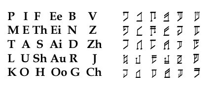
At the beginning, I just wanted something simple, runes, lines that could be drawn in the dirt, or carved on wood or stone. I believed, because of the D'Ni numerals, that I could later create a flowing, cursive or italic form that would make a pretty script. But I really wanted the letters to correspond to the IPA chart in some way, so that the letters sort of proclaimed where in the mouth they were pronounced. I started seeing how many letters I could get out of similar shapes, and started grouping the phonemes, so that I could decide which shapes might go with which letters. Here you can see the first phonology, arrangement and alphabet I produced, which I was pretty happy with. The plosives all have the same basic shape; a top stroke marks the plosive at the front of the mouth, P, and the bottom stroke marks the plosive at the back of the mouth, K. A line down the middle of each of these marks them as voiced, to get B, D, G. The fricatives are in the middle and all have a stroke on the left side. I made F & Th related, as an extra stroke differentiates Th from F, and the same with S & Sh. The nasals and liquids are different, and especially for R I wanted something that was unique, because I had imagined some sort of "half-consonant, half-vowel" status for R (later I found out about semi-vowels), so I made a letter that has the root shapes of the consonant and vowel combined. I gave L a similar type of character. The five letters in the last column were supposed to be sounds that came into the language later, and thus have a subtlely different look. Z and J carry on the tradition of putting a line through the middle of the character to show that it is voiced; in fact Z is merely a voiced S character. Ch and J are supposed to look like combined versions of letters; T + Sh=Ch, D + Zh=J.
So my design principles were relatively satisfied. I did not create a formal chart of strokes as I had previously imagined from reading this page about the D'Ni language from the Myst games, but the characters reflected at least some data about where they were pronounced in the mouth. I was happy with this alphabet, and I knew I needed to spend more time actually developing the grammer, cases and such. I didn't know much about such things. I've never taken a linguistics course, so I started reading a lot of pages on Wikipedia, about cases, tenses, grammer, and such, and re-reading the Language Construction Kits, but I couldn't seem to put it all together. Until the Second Language Creation Conference...
On another note, I made a font for this alphabet using Font Creator, made by High-Logic. This is a fantastic program for making fonts! Its expensive, but if all you want to do is make a conlang font, you can download it and use it for a month for free, which should be all the time you need to make a font or two.
So by this time I had all the pieces: the basic letter shapes, the design principles, alphabets to draw more ideas from, etc. It was time to put the pieces together and really create an alphabet.
At the beginning, I just wanted something simple, runes, lines that could be drawn in the dirt, or carved on wood or stone. I believed, because of the D'Ni numerals, that I could later create a flowing, cursive or italic form that would make a pretty script. But I really wanted the letters to correspond to the IPA chart in some way, so that the letters sort of proclaimed where in the mouth they were pronounced. I started seeing how many letters I could get out of similar shapes, and started grouping the phonemes, so that I could decide which shapes might go with which letters.
 Here you can see the first phonology, arrangement and alphabet I produced, which I was pretty happy with. The plosives all have the same basic shape; a top stroke marks the plosive at the front of the mouth, P, and the bottom stroke marks the plosive at the back of the mouth, K. A line down the middle of each of these marks them as voiced, to get B, D, G. The fricatives are in the middle and all have a stroke on the left side. I made F & Th related, as an extra stroke differentiates Th from F, and the same with S & Sh. The nasals and liquids are different, and especially for R I wanted something that was unique, because I had imagined some sort of "half-consonant, half-vowel" status for R (later I found out about semi-vowels), so I made a letter that has the root shapes of the consonant and vowel combined. I gave L a similar type of character. The five letters in the last column were supposed to be sounds that came into the language later, and thus have a subtlely different look. Z and J carry on the tradition of putting a line through the middle of the character to show that it is voiced; in fact Z is merely a voiced S character. Ch and J are supposed to look like combined versions of letters; T + Sh=Ch, D + Zh=J.
So my design principles were relatively satisfied. I did not create a formal chart of strokes as I had previously imagined from reading this page about the D'Ni language from the Myst games, but the characters reflected at least some data about where they were pronounced in the mouth. I was happy with this alphabet, and I knew I needed to spend more time actually developing the grammer, cases and such. I didn't know much about such things. I've never taken a linguistics course, so I started reading a lot of pages on Wikipedia, about cases, tenses, grammer, and such, and re-reading the Language Construction Kits, but I couldn't seem to put it all together. Until the Second Language Creation Conference...
On another note, I made a font for this alphabet using Font Creator, made by High-Logic. This is a fantastic program for making fonts! Its expensive, but if all you want to do is make a conlang font, you can download it and use it for a month for free, which should be all the time you need to make a font or two.
Comments
.....But I don't remember where. I think it was the ZBB. Keep this up! I love this blog.
Brittanie
P.S. Remember, if someone wants to take your idea and change it, its because they like what you've done.
:-]
[I wrote jus before]
I've always liked doing this kind of thing. Me and my friend created an alphabet based on Korean.
I think you should be proud of your alphabet. Its great!
If you have any questions just email me at timothysheets1@gmail.com. Also communication via email is the best for me.
Wow! I cant belive we share the same interst. I have made a phonetic alphebet and now I can write in my language without people knowing what i am writing. When i tried fonts struct it doesnt let me draw my alphabet the way i want. why is this?