Part One, this is Part Two, Part Three
So once I had my design principles, and I had decided what alphabets to use as inspiration, I just started copying the characters that I liked, and I started playing with them. I'd flip them around, I'd change a stroke or two, and I'd improvise. I'll post a page or two of some of these ramblings. Basically, whenever I was in a meeting, going somewhere on BART, whenever I was sitting and getting bored, the notebook came out and I started to doodle.
After I fooled around with the characters, I'd come back to the design principles. I liked the curves and angles of Tibetan, but if I was going to integrate the D'Ni design of combined simple strokes, Georgian was better for inspiring simple strokes that could be combined. But as I played with the characters, and tried to see how many characters I could make that I liked the look of, and that reflected the design principles... I wasn't liking the results. I didn't necessarily want a beautiful alphabet, but I wanted something that I liked, that I could write easily, and that had a distinct look.
The breakthrough for me was when I decided that I needed some sort of "root shape" or shapes for the letters. For example, in English, a round circle could be the root shape for O of course, but also for G, C, Q, D, and U. Lower case letters especially share root shapes: b, d, g, o, p, and q; m, n, u, v, w. I'm not sure I'm conveying this concept clearly enough, so I'll put another pic on Flickr.com to show it.
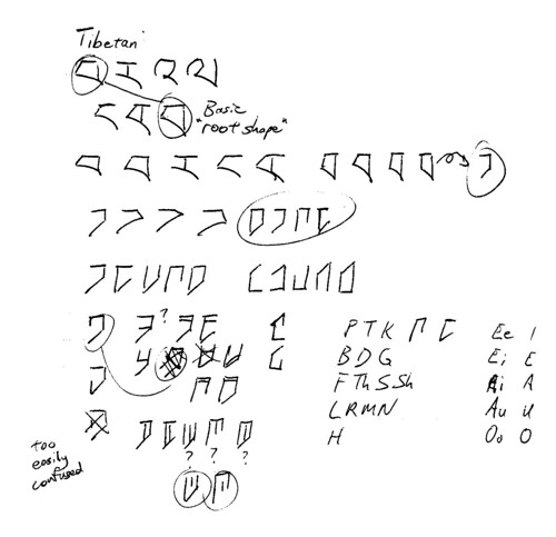
 I chose a root shape from the Tibetan alphabet. I flipped it around backward and made it narrower, and decided to take off different sides to get different characters, and add little strokes to make more characters. Then I flipped it upside down to get more characters, and decided to make all those upside down characters vowels, to clearly differentiate between consonant and vowel characters. I didn't make any character too complex, or make characters with strokes too close together, so it could be easy to write and not confuse different characters for each other. At this point I was pleased with what I was getting, and I realized something: when I tried something that seemed to work, my enthusiasm for working on the conlang surged, and my progress jumped to lightspeed.
I'll write one more Orthography post, detailing how I finally assigned sounds to the alphabet of the conlang.
Continue to Part Three!
So once I had my design principles, and I had decided what alphabets to use as inspiration, I just started copying the characters that I liked, and I started playing with them. I'd flip them around, I'd change a stroke or two, and I'd improvise. I'll post a page or two of some of these ramblings. Basically, whenever I was in a meeting, going somewhere on BART, whenever I was sitting and getting bored, the notebook came out and I started to doodle.
After I fooled around with the characters, I'd come back to the design principles. I liked the curves and angles of Tibetan, but if I was going to integrate the D'Ni design of combined simple strokes, Georgian was better for inspiring simple strokes that could be combined. But as I played with the characters, and tried to see how many characters I could make that I liked the look of, and that reflected the design principles... I wasn't liking the results. I didn't necessarily want a beautiful alphabet, but I wanted something that I liked, that I could write easily, and that had a distinct look.
The breakthrough for me was when I decided that I needed some sort of "root shape" or shapes for the letters. For example, in English, a round circle could be the root shape for O of course, but also for G, C, Q, D, and U. Lower case letters especially share root shapes: b, d, g, o, p, and q; m, n, u, v, w. I'm not sure I'm conveying this concept clearly enough, so I'll put another pic on Flickr.com to show it.
 I chose a root shape from the Tibetan alphabet. I flipped it around backward and made it narrower, and decided to take off different sides to get different characters, and add little strokes to make more characters. Then I flipped it upside down to get more characters, and decided to make all those upside down characters vowels, to clearly differentiate between consonant and vowel characters. I didn't make any character too complex, or make characters with strokes too close together, so it could be easy to write and not confuse different characters for each other. At this point I was pleased with what I was getting, and I realized something: when I tried something that seemed to work, my enthusiasm for working on the conlang surged, and my progress jumped to lightspeed.
I'll write one more Orthography post, detailing how I finally assigned sounds to the alphabet of the conlang.
Continue to Part Three!
Comments